An Interview with Set Designer Rachel Hauck
May 21st, 2019
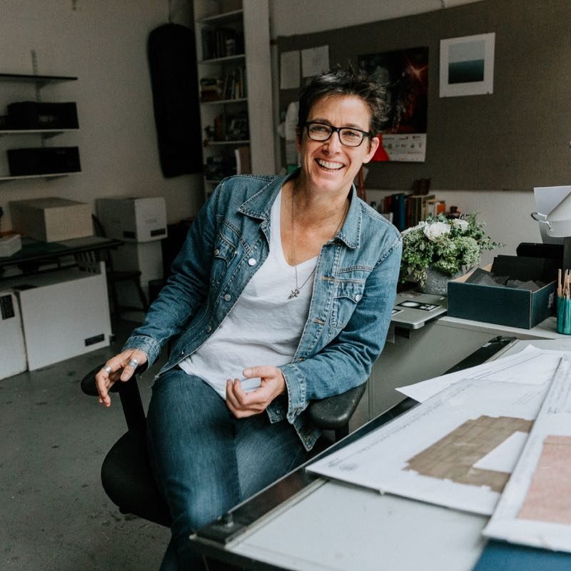
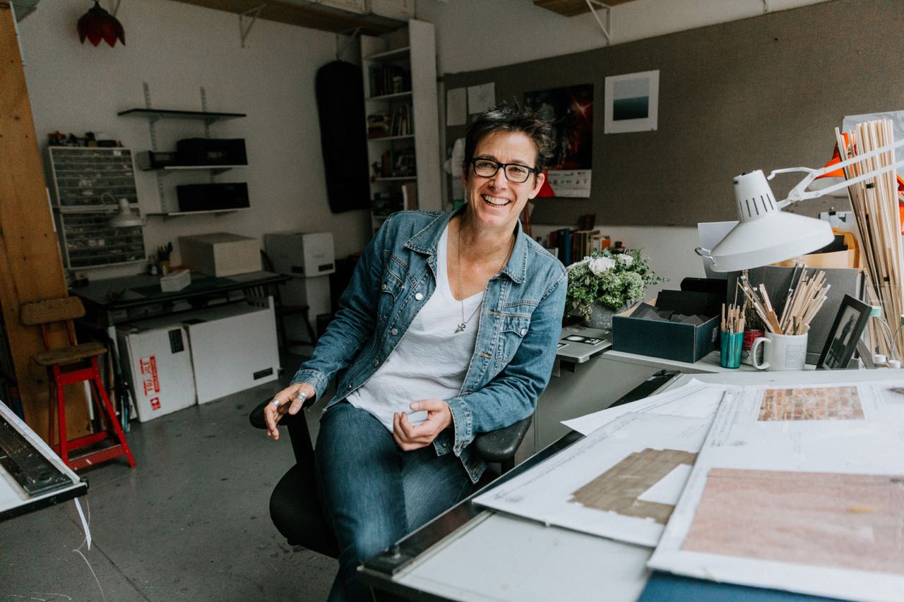
This season, two of the most complicated sets on Broadway were designed by Rachel Hauck. And by complicated, I don’t just mean technically (although one of them has swinging lights and a turntable and a big reveal, and listen, you try fitting all of that into an old Broadway theatre with limited fly and wing space). This season, Rachel Hauck designed the two most emotionally complicated sets on Broadway. For the musical Hadestown, Hauck had the task of figuring out a design for a show that lives in metaphor, and with the mandate from the creators, Anais Mitchell and Rachel Chavkin, that “it’s a poetry piece, not prose.” For Hadestown, Hauck earned her first Tony nomination for Best Set Design of a Musical. She also designed the set for Heidi Schreck’s Tony-nominated What the Constitution Means to Me, the most intellectually and emotionally rigorous play to be on Broadway in years. For Constitution, Hauck had to create a set that both supported the complexity of the play’s form and allowed it to breathe. Both Hadestown and Constitution were shows where the sets could have been anything, and both had long gestation periods before getting to Broadway—and now that they’ve arrived, it makes Hauck the only female set designer in the 2018/19 season to design the sets for both a Broadway play and musical. I recently spoke to her in her studio about how she became a set designer, designing for new work, her process for creating the sets for Hadestown and What the Constitution Means to Me, and more.
How did you get into set design?
I got into it in high school. I went to a class with my friend who wanted to audition to be in a play. In our high school, you couldn’t audition to be in a play until you’d gone in on the weekend to build scenery, and she didn’t want to do that by herself. So I tagged along with her. She lasted about two days and I was like, “That’s what I want to do.” [The play] was William Inge’s Picnic, and there was a model designed by an architect. The guy who was designing the play was an architect named James D. Hill. Those guys really know how to make models. I looked at that and I was like, “That. I want to do that. I understand how to tell a story like that.” I was a freshman in high school and I never wanted to do anything else, and so I pursued it.
I had four solid years of high school drama, like a super geek. Then I went to UCLA and got a BA in theatre. I really wanted to go to a conservatory but my parents were very determined, correctly, that I get a Liberal Arts education, and I am so grateful to them for it because it really changed the way I think. How to think about the world a little bit more fully was really, really helpful to me.
I got a terrific internship in television, actually, right out of college. I worked through the Television Academy. I did two months with them, one month on the soap operas and one month on the sitcoms. I was working for a guy named Dahl Delu who designed Cheers, Dear John, and the first season of The Fresh Prince of Bel-Air. Then I got a job on The Fresh Prince and stayed on that for about a year and a half. I got fired for having an attitude problem, and they say if you get fired from your first job in TV it means you will work forever. I went back to theatre. I did work in TV for a couple more years, but I was doing theatre on the side. It became a moment where I needed to choose, and I chose theatre.
I went away to Europe for three months and walked around and cleared my head with my backpack, like you’re supposed to do at that age. Then I started working with two equal and opposite, terrific companies in LA. One is the Actors’ Gang, which breaks every possible rule and works in all kinds of interesting ways. And with the Mark Taper Forum, which had remarkable new works. There were five people who had gotten Mellon Grants to work at the Taper at the same time. It was Luis Alfaro, Diane Rodriguez, Chay Yew, John Belluso and Lisa Peterson, my partner of many years. And so, they were all in LA working for Gordon Davidson at the same time and they connected the community of writers in all different ways.
It was an extraordinary period of new work development at the Taper. I just got lucky and started kicking around the halls there. I learned the combination of things, and that was sort of my grad school. I learned the rules from the Taper and I learned how the break them at the Gang—I always knew how to break them, that’s my gift. Learning the rules was the harder part.
Eventually, I started to work regionally, but it’s always been new plays, it’s always been new work. Lisa and I met at the Taper and started dating then. She always had an apartment in New York. So we were going back and forth from New York to the regional [theatres] to LA doing all of that work together.
With set design, is there a big difference between new work and revivals?
Oh, completely. Completely, completely different. Every play is different, every playwright is different. Where they are with their work when it goes into rehearsal is different. There’s always great ideas, there’s always great text, but the moment that the set designer shows up and you have to figure out how it actually looks, it becomes more real in a different way.
I got really lucky to be in the room for all of that development work at the Taper. There’s nothing more generous than hearing playwrights read each others’ plays, and what you learn about how to listen to a new play from that. Then I went to the O’Neill, where for ten summers we worked on new plays, and it’s all about helping a writer imagine their own world.
When you’re working on a new play in a new rehearsal room and you know where you’re actually going to do the production, in those conversations there’s a director and the director is absolutely the captain of the ship. But there’s a real generosity in working with playwrights that is about knowing they are still discovering their work, and if it’s the first production, they’re going to learn a ton from the actors. [Part of my job is] just trying to make it as possible as it can be for them to continue to discover the play. Meaning, if it’s at all possible, the set is not designed in a way to limit something like the reordering of scenes, or the changing of a detail.
Over the course of your career, what’s the biggest thing you’ve learned about how to function in that process, especially in those like early meetings where rehearsals haven’t started? What’s your jumping in point?
This is an obvious thing to say, but my jumping in point is always the text. Particularly a project like Hadestown, where it could be just anything, going back to the spirit of the text is key. When I sit down with the director to talk about a play for the first time, that conversation is a great two hour wild ride with a lot of coffee and no imagery and no ideas. I will read the play a couple of times before that meeting, but I won’t form any ideas about how it should look until I talk to the director because what the director is interested in is absolutely the lead to follow. Even with a play that has super specific stage directions and descriptions of the world, there’s 500 different ways that that play could look and still honor every word of the stage directions. It’s about what the director is excited about, and if the playwright is with us, what the playwright is thinking about, that’s the leaping off point.
Then we come back here and do an enormous amount of visual research, even if we’re going to fully abstract it, I want to know exactly what it is I’m abstracting. Why this clothesline and not that clothesline and how different those things can be in the world. We do an enormous amount of research here and I’m very fortunate to have an extraordinary assistant that works with me. Jessie [Bonaventure] does an enormous amount of visual research and then we shape it and shape it and shape it. Then I bring that to the director and the playwright, if they are interested in being in that part of the process. And that’s a jumping off point [too], because you now have research of what these places really look like, what feels right, what’s interesting to you. So if we start with 200 images of something as specific as, for example, All The Ways To Say I Love You, which took place in a confined a high school guidance counselor’s office, how could that space look? Which of these is most exciting? Which of these feels right? And then, how is that world going to invert on itself? All of those come from real images. I’ll look through that list with a director—in that case Leigh [Silverman]—and say, “Here are the 15 images that are most exciting to us.” Then I’ll come back here.
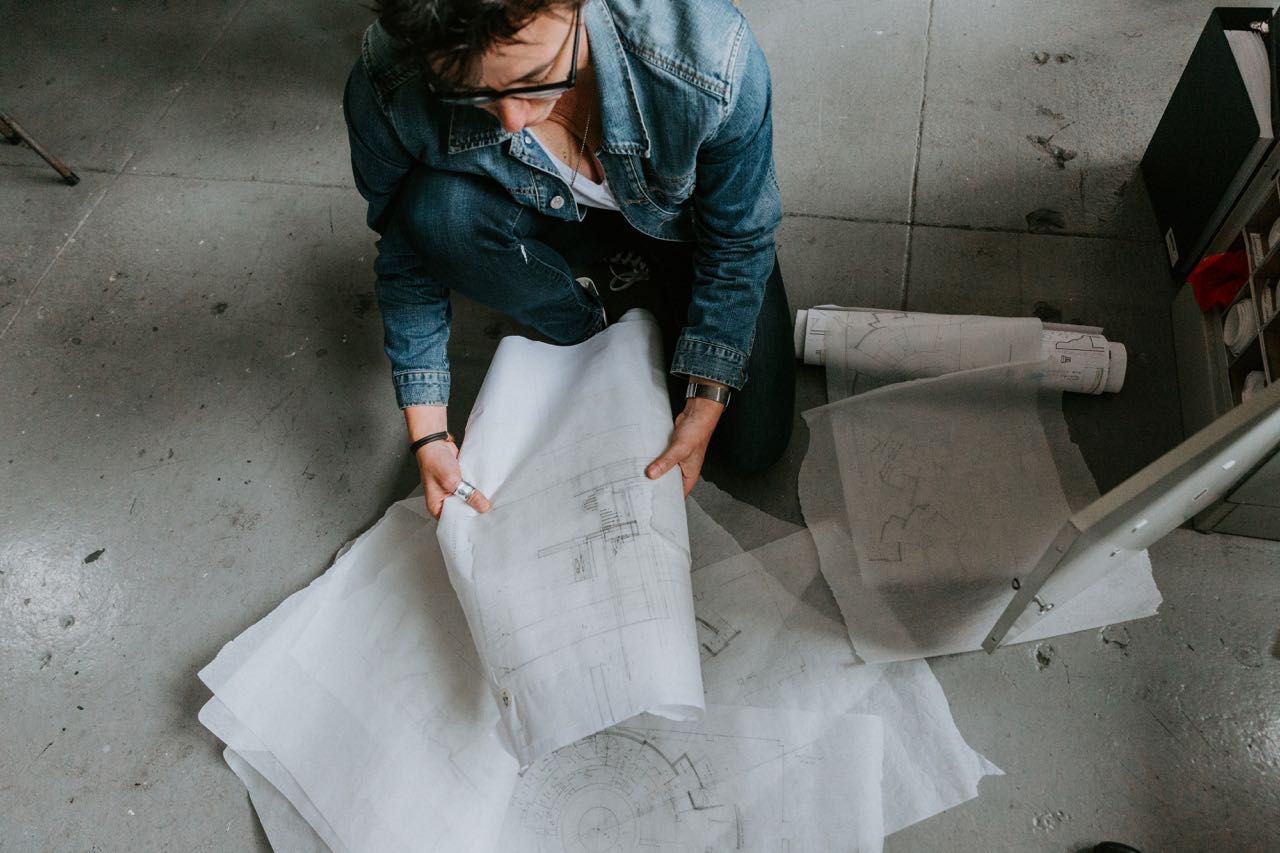
I work through models, so I build a very specific model of the theatre space itself because there’s a singular relationship between the stage and the audience, it’s different in every room you’re in, so understanding what that space is and how it works and how it feels to be in that room is fundamental to how the design will shape. I put the research all up on the bulletin board and I have that model in front of me and I start sketching in models. I have all these little toys, all these little quarter-inch versions of things. Then, you start to find the shape of the world. I get to a certain point and then I’m like, “Well, this is worth looking at with the director.” And the director comes over, and we push it around and take it apart and cut it apart and shift it. It just starts to form. But that part of like, “How do you make the actual design,” I don’t know, that stuff’s magic, right? It comes from that squishy other place that you can’t really define.
From talking to a lot of playwrights and directors—I’ve noticed particularly with the playwrights—there are some who are visual, and some who are really, really not visual. Directors tend to be more visual. But visual language and how people describe things visually can be so diverse, and usually everyone is not using the same words to mean the same things when translating from the text to what it’s going to look like. Over the course of your career, have you found tricks in terms of how you communicate with playwrights and directors and how you listen to them to figure out like, “Oh, you’re saying this, but what you actually mean is this”?
Absolutely. I work very hard to be as approachable as possible. I work very hard to keep things low key, which as a Californian isn’t that big of a reach for me. I don’t want to be intimidating, I don’t want to be unapproachable. I make as safe a space as I can for everybody to have the dumbest ideas together as possible. Of course, the director is the leader in all of that. But, for example, with research, if you have 300 images to start with and you start to have a Rorschach test of this one feels right, and this one feels wrong, at the end of going through all those images, you have 20 images that, for whatever reason, feel right to the director and the playwright. If the director is responding to those things, if you print them all out and lay them all out, you will discover there is some vocabulary that’s forming. I want them to talk to me about how the play is going to work emotionally. That’s the stuff that I’m excited about. And then it’s my job to figure out how to translate it with all that stuff around them. Some directors are super visual and they get their hands dirty with you. There are some director who are like, “I don’t know, that’s just not right, and let’s try again. I can’t quite say why that works or why it doesn’t but it feels not right to me.” And then I am working to help find something I can hang onto and be like, “I understand what you mean by that. I understand how to make the world feel like that.”
Let’s talk about Hadestown.
I think Hadestown is probably the hardest thing I’ve ever done. It’s an incredible family of artists. [Composer] Anaïs Mitchell is a magic person. [Director] Rachel Chavkin is incredible. And that could have looked like anything. Because it starts from the concert album.
When I talked to Rachel [Chavkin], she mentioned that a big thing was how you translate the poetry of the piece and finding concrete and specific things in the metaphor, and to not make it look like, “Oh, it’s anything and everywhere.” Figuring out how to anchor it enough and still allow for that other metaphoric thing to happen.
It’s very much like, you know what you need to know about the story and how it unfolds in the lyrics. And how to find a way to not trap yourself in any one world because Anaïs is traveling so many worlds. Poetry first is absolutely the first thing those guys walked in here and said. If you are going to listen to the music and respond to the music, that’s the grounding. The quality of that music is the grounding force of everything that comes out of that.
You need very little to actually tell the story. There are very few hand props in that world. There is big emotion in that world. So [one of the questions became] how to not get in your own way. We had a couple journeys about that.
The first version of this at New York Theatre Workshop was absolutely concert first. That was the thing we knew most. Concert, and starting to figure out how that story unfolded. The album was incredible, Anaïs wrote a lot of music. We had an incredible cast and those guys developing what those ideas are together. That space that we developed for the workshop was absolutely a safe space. It was like a dramatized concert. And the dominant influences for that design were concert, Greek amphitheaters, barns, Pete Seeger, Bob Dylan, and that kind of music. All of the Dust Bowl imagery was really prominent, and that led the way in that production. Now, quite clearly, New Orleans has become the dominant image in the design. Rachel very, very much knew it was not linear, it was ovular. So we tried a lot of things before we kindly asked New York Theatre Workshop if we could rebuild their entire theatre. It just feels round, it feels warm. That space was a magical space, it felt like being outside in Vermont.
Then we went to Canada and we were like, “Well, how do you take this thing that works so beautifully on its own, that people responded to so purely on its own merits, and just rethink all these ideas?” We set all that stuff aside and said, “Let’s try again, let’s see what happens if there’s railroad tracks and trees and grass and we made them all magical.” We put the turntables on top of the stage rather than flush with the stage, so it made it sort of an altar. We had this giant, beautiful, silver tree. It was all beautifully built and it was cold. It was cold, and it was like, the stuff that had felt like exactly the right imagery suddenly was not the right thing. We had lost our intimacy with those characters in that world.
Rachel’s two starting ideas for this play is that incredible image of those swinging lights, and the image of a really beautiful, dynamic tree, which is an incredible grounding image in a lot of Greek myth and a lot of storytelling myth across all cultures. And she knew she wanted this huge transition when you go underground that felt like going underground. I couldn’t figure out how to do it within the limitations of the workshop; we talked about a ton of things but I couldn’t get my head around how to do it in a way that felt like what she was describing. So, we let it go for there. In Canada, where we were in a traditional theatre, that tree, instead of being dynamic and coming over the audience, was a two-dimensional theatrical tree. And then, when it flew, it was like a piece of scenery flying, it didn’t have any emotional impact. We knew right away, something’s wrong, we’ve lost our connection to these characters. We put half of that scenery on the dock immediately, we just cut it, which is an extraordinarily brave thing to do. That was the day we made all those changes, and everybody was so happy. You could just see it felt right.
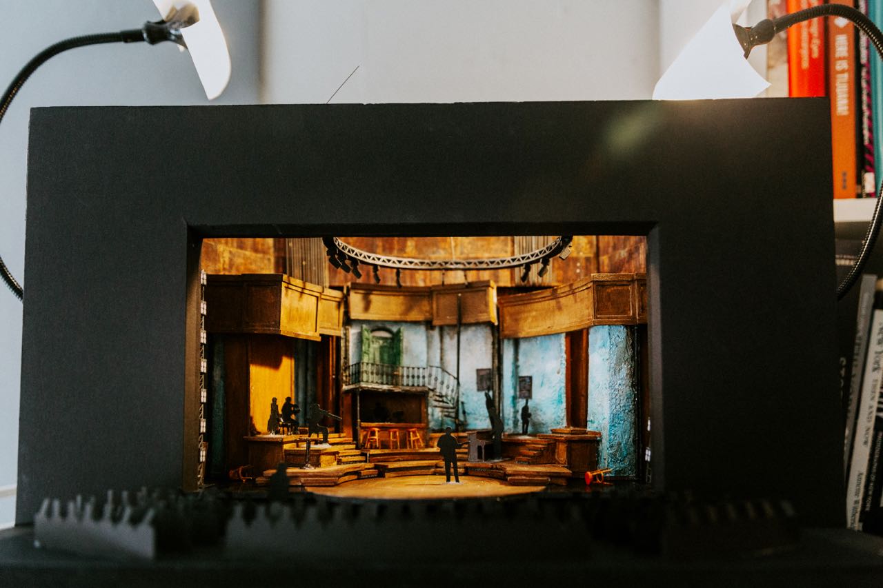
We started working on the London design about a month after Canada. And we started working on the generic Broadway design, hopeful it would come here. So we started developing these ideas independent of knowing where we were going to do them. About three months into that process, the opportunity to go to the Olivier came up and they said, “Are you available like tomorrow to go to London and see the Olivier?” And I said, “Yes. Yes, I am.” I cleared the calendar and got on a plane, and sat in an incredible theatre, and I just kind of looked at those people and said, “The design we are working on looks like it was designed for this space, it’s crazy.” So that was a natural, easy fit. That’s where we found the bar. That’s where we found New Orleans. We went back to the amphitheater; it feels embracing, it feels warm. The band is absolutely central. Greek amphitheater is unmissable in the imagery, and New Orleans. You let David Neumann’s incredible choreography and Rachel’s remarkable staging and that cast just tell the story with the pieces they have.
For something like this there is also a lot that is evoked and almost tricking the audience into thinking that they’re seeing more than what’s actually there. For example, when you’re going from one world to another how do you get the audience to feel the different temperatures of the spaces, which obviously aren’t actually changing. How do you do that?
A huge part in that storytelling is [Lighting Designer] Bradley King and [Costume Designer] Michael Krass. I am an abstract thinker, I’m an abstract designer. I know what a difference it makes if you choose this glass over that glass and what the audience will do with that. I know that what you see in this glass is different than what I see in this glass. And so, in a way, we are asking the audience to invest themselves. In every abstract design, you’re asking the audience to fill in what’s around it. We are giving them a lot of tools. Like those rotting walls are rotting blue walls, but they’re also skies, they’re also not skies. We can make it feel like you’re outside or inside. We can make it feel teeny and we can make it feel vast. But, a huge part of it is trusting that if we have an emotional response to it, they will have an emotional response to it.
We did a bunch of things. It’s a lot warmer when you’re above ground because it’s small and there’s this tiny bit of furniture on it, which makes it cozy. And then, you take that furniture away, and suddenly it’s not so cozy. And then, the world splits apart and it’s a whole different thing. There’s a New Orleans bar, there’s an oyster platform, there’s all that beautiful Nola. There are storm doors. It’s spring, it’s winter. That’s such a simple way to tell the season, and also the generosity of how open it feels when there’s a little café table up there and people are hanging out eating and having a drink and having some oysters. And then, when it’s winter, that stuff closes. There are five million little tricks. The green is not so bright on the other side of the doors. The doors are not in such good shape once you see them. And of course, once the world splits, all the stuff that felt like a deteriorating New Orleans world, when that stuff goes out and you can see the rot on the walls,
it’s all the same space, but that feels incredibly different. It feels like there’s something contained, and that feels like your stomach’s going to flip a little bit.
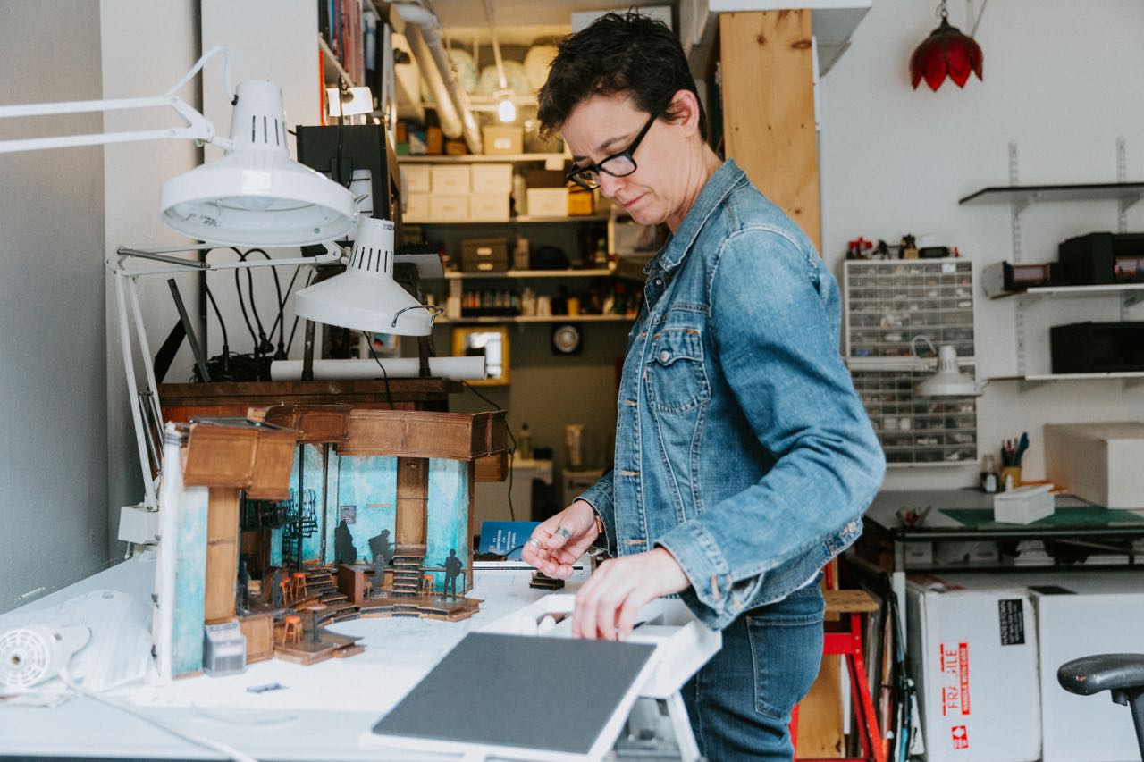
There’s also the practical aspect to all of this. Dealing with the actual physical space of the theatre—limited wing space, limited fly space—and actor safety.
It was really hard. It is also technically the hardest thing I’ve ever done. I have a stellar associate, Meredith Reese, who, thank God, has done a few Broadway musicals before this one. The trick of this is how small the Walter Kerr actually is. So making this actually technically fit is a sort of a feat of engineering. Together we worked out all these plans, and then sent them to the remarkable shop, and those guys figured out technically how to make things move. You might notice that the turntables turn while those wagons are in place, and you might notice that those wagons actually have things like pianos on them. So how do you have a turntable turn under a platform that has a piano on it and not make it really loud, and also it’s a planked wood floor, turning under a turntable that has casters on it, and that will put the piano out of tune. The complications are amazing.
Those swinging lights are the most complicated engineering thing you’ll see to create the simplest, most elegant, beautiful, breathtaking thing. And where do you bury all the speakers so that the actors have their playback and can hear what the musicians have? How do you isolate the sound of a drummer but keep him dead stage center? How you get actors to that second level with nowhere to put an access? There’s nowhere to put the stairs to that [platform], so that’s one of my favorite tricks in the show that nobody ever has asked about, which is how do those actors get to that platform? It feels like the space is enormous and it’s all just in plain sight.
The first time I did a play that I was really proud of, it was a super minimalist play. Minimalism is not for the faint of heart. It’s very, very, very challenging. And I was talking to my dad about it at the time, about how hard it was, when he finally saw it he said, “Well, that didn’t look hard.” I was both infuriated and I was like, “Oh, that’s how I know we got it.” Because it looks just like the most obvious thing. It’s like, of course you’d tell the story at a New Orleans bar with some bar tables, of course.
Let’s talk about What the Constitution Means to Me. Let’s start at the beginning there too.
Maria Striar [Founder and Artistic Director of Clubbed Thumb] sent me a genius email that said, “So, Heidi Schreck’s written a thing. We don’t know what it is. There’s about 13 pages of material, she’s going to work on it throughout this, it could be anything. It could be a huge piece of scenery, it could be nothing. The brilliant [director] Oliver Butler is in the room with her. We know we’re going to make something, are you game?” And, I was like, “Absolutely.” “The budget is $2,000 dollars, the fee is like five bucks. Are you game?” And I was like, “Absolutely.” I’ve designed two of Heidi’s other plays. She is very dear to me, she’s an incredible writer. I was very honored to be asked because from the jump on that, it’s been an incredibly vulnerable piece to create. I love things that breathe and change.
Heidi was really reaching for how the play would take shape. She had that incredible first bit, and how do you expand it? And what should it be? The design is a gut reaction to what she’s talking about. We did a lot of research of all these different American legion halls and Seattle and the timber industry. Oliver had very strong feelings about making sure that we represented a lot of different things in the story. As it was starting to develop, we knew there would be a debater. We didn’t know what that would be, but we had incredible 12-year-old Rosdely [Ciprian] in the room.
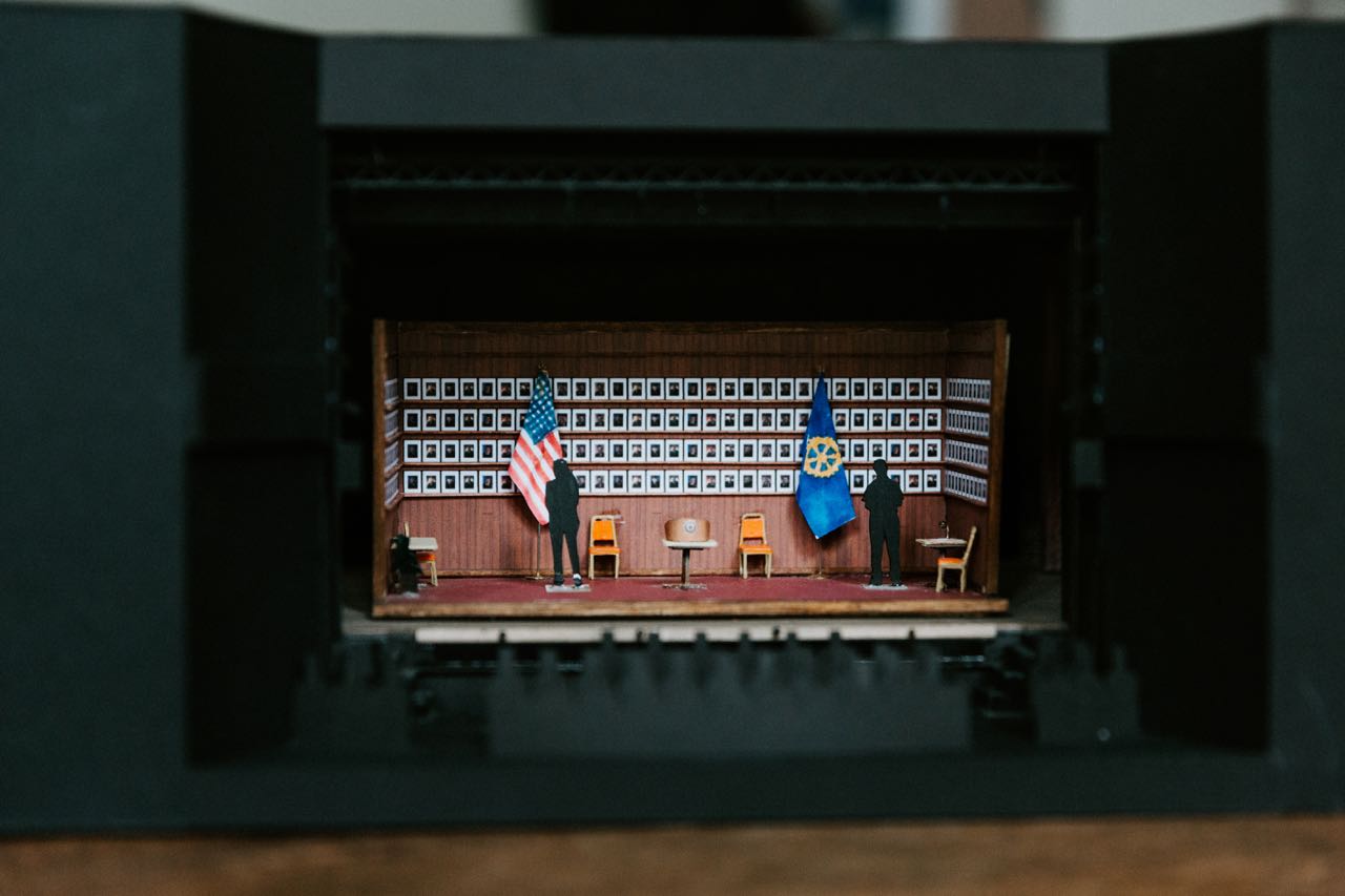
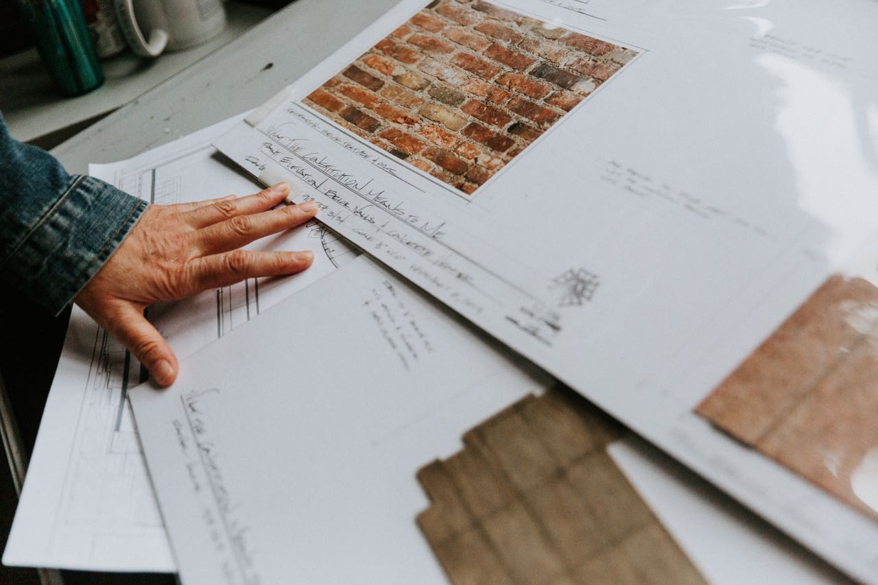
I found a very specific research image of an old guy in a legion hall with wood paneled walls. It was the cafeteria part of the hall, and there were super American red and white checks on the tablecloth and rows and rows and rows of pictures of Legionnaires and this guy taking his coffee. And I was like, “That’s it, that’s what you were talking about. That’s exactly what you’re talking about.” I just knew it was the world. And we had all these conversations, which she sort of teases out, [like] should there be a door? There was a period where the whole side wall was dedicated to the timber industry.
We waited a very long time to design this because she was writing it. I knew we had to be able to execute it with the resources we had at Clubbed Thumb, which are super limited. And I knew that I did not want the set to be the reason that Heidi couldn’t keep thinking about the play. That’s very important to me. So, we waited a long time and poor Maria Striar was starting to get nervous. I was like, “It’s going to be okay.” And then I sort of kicked in the door and I was like, “You know, [in an early version] we had this idea of [a line in the play about] a diorama that Heidi had built herself, right? And everything about that suited what she was talking about and the place we were doing the play.” I was like, “Well, these should be eight foot tall flats, this should be synthetic siding that you can get at Home Depot, it should be a carpet that’s one roll deep. And then, these pictures.” All those details come straight from research. A series of images were put together about what the cafeteria tables look like, what that homemade lectern looks like. There’s a plant, which somebody’s wife bought one day, and it’s the great outdoors represented in a single plant. It was just sort of mind meld between Heidi and I. I was like, “I think you’re talking about what it is to be a young woman in the middle of this world of men.” Heidi talks about this a lot, but the first time she got on that set at Clubbed Thumb, she freaked out. She totally freaked out. That set is one of the meanest things I’ve ever done to an actor because to stand on that set is to be the target of the eyes of 163 men who are just standing there. We talked about, should there be a door? Should there be a way out? I felt very strongly that the key to it was the emotional trap of standing in that space.
As the play has grown and changed, the gut connection has never changed. It’s changed shape and scale and it’s gotten bigger, it’s gotten nicer. It’s all natural wood now, that’s stained, as opposed to synthetic wood. The lectern is hand made and everything has care to it. But that image has never changed.
Something that’s interesting to me in relation to what we were discussing with Hadestown, is that really this could have been anything, too. You could have gone with something abstract. You mentioned that there’s one image you found, but was there anything else? Or anything textually or something that happened in the rehearsal room where you were like, “Oh no, no, it really is a legion hall?”
We were designing the Canadian production of Hadestown at the same time we were doing this production at Clubbed Thumb, and I was going back and forth. I spent as much time in that rehearsal room as I could. I just kept bringing in all of this research without any agenda and being like, “Here’s the world you’re talking about, remember?” And she would be like, “Oh yeah, that’s those, I remember those places, I remember going to all those worlds.” I knew that design before I knew if it was right for where she was going. I just knew it. We talked about a lot of options. I’m a big believer of, okay great, if you got that in your brain, you can always go back to it, set it aside. We riffed on a whole bunch of other things. We were like, well, it could be a bunch of really dumb theatrical drops. The comedy has always been essential for her to be able to do that. There’s a tone question. And making sure it didn’t get too heavy so that you couldn’t hear it was very important. For example, the presence of those guys [in the photos] changes the more you’re with them.
So we talked about a few things, but we landed at [the design] pretty quickly. And then we did a lot of different versions of it—things that softened it and things that made it harder. Then Oliver started to talk about it like a diorama. It’s very important for Heidi to start outside of it and step inside of it, and for that world to be controlled and a thing that she’s in control of to a certain extent—that is essential. Knowing that there was a really limited space where she couldn’t comment on the world and then step into the world and then become her younger self, and then stop being that. But that whole amazing line about, “I wish this could all go away now,” and that there would be a big, cool set change? We looked at all different versions of that and Oliver and I and were both like, “I don’t think it does that.” I think the problem was they didn’t go anywhere. It’s been an incredibly generous process and that piece gets richer and richer and richer. I feel about both these pieces that they are both their pure selves from downtown to uptown. They both changed significantly, but it’s like they’ve both just become richer versions of themselves.
Could we talk a little bit more about tone for Constitution? It goes so many places in terms of being quite funny, then quite serious, and when it zooms in and when it zooms out. How do you balance that in a design that’s static but doesn’t actually always feel static because it gives her the space when she goes to other places to take the audience with her?
There’s no easy answer to that. It’s so much about making room for that to happen and then letting the super brilliant lighting and sound designers do that. [Lighting Designer] Jen Schriever, who is brilliant, is super quietly, really manipulative. We’re very much in control of when that room feels like a neutral space, and when it feels menacing, and how keenly and at what point you are aware of those faces. One of the things that we did, essentially by the placement of those photographs, is make it possible for them to disappear as wallpaper, or, depending on what Jen’s up to and Oliver’s up to, make you aware of them as individuals. That’s how that changes tone so aggressively. In the same way that Mike [Iveson] as Mel Younkin changes. He holds his hand in this fist for the whole course of the show and you feel a tension from that guy. As Mike dissipates from, and stops being Mel and starts being Mike—and there’s a significant portion of really vulnerable text once he’s just Mike up there—that changes the whole room.
An enormous amount of it is, of course, in Heidi’s control. That performance is extraordinary. Heidi is walking a knife’s edge. Having seen this show so many times, I still never know when she’s in control and when she’s out of control. She is willing to place herself in a very vulnerable place, and so a lot of what you’re responding to is simply her. And it’s her remarkable control over how the world feels when she’s 15, when she’s 40, when she thinks she’s in control, when she knows she’s not in control. That’s an incredible actor, that’s not me. That is me giving these tools and being 100% present for that conversation and watching what they do with those tools. Knowing what I know the potential of it is, and an enormous amount of that is gut. It’s very collaborative. There’s no part of it that’s just me. There’s no part of it that you know if I was designing Heidi’s play and somebody other than Oliver was directing it, it would look different. It’s all the ingredients together.
There’s so much visual stimulus today. Do you see the way people read things visually as changing, or the level of visual literacy changing?
I don’t. I think that theatre design is always evolving. And that can mean a million different things right now. Just like every other corner of the planet, there is what’s becoming possible because of technology. And I mean that in every level. Obviously, Hadestown is one level of technology. The way that everybody thinks is changing now, and that translates through all of us in ways that I don’t even know that I know.
I think theatre has an ability to speak directly to people emotionally by being in the physical room that’s all its own. Theatre design is fundamentally different from design for television or film, even if everybody’s doing realism. There is something fundamental that happens when you’re in the same room. There’s a singular vocabulary that happens between an audience and a stage, which allows a kind of magic realism. It allows a kind of abstraction. It allows a different vocabulary to enter the picture than you can have with any other medium. That means you can make rules and change the rules and it has a different emotional impact. That’s what we’re fooling around with in Hadestown. It’s like, “These are the rules. Oh no, those aren’t the rules. Oh, now you’re gutted.” And in Heidi’s world, one of the things that’s my favorite thing about that set is the box itself is one thing, but the world around it is another. It’s the thing that we discovered in New York Theatre Workshop was that there’s actually a secret, gigantic beam that’s in the back. It’s a concrete header that’s across the room that’s just quietly oppressive. It makes the space heavy. And that is a thing nobody’s aware of. Heidi didn’t even know we did it. We did it at the Workshop, and it just completely changed the room. At the Helen Hayes, too. There’s that sense of being in the world, and being around the world at the same time. Those things are fundamental to theatre.
So one gender question. There are beginning to be more female designers on Broadway. But it’s still slow. Why do you think that is? What can be done to change it?
Rachel [Chavkin] actually spoke so beautifully about this in the interview you did with her, and I couldn’t agree more. It’s about giving people opportunity. This industry is not financially rewarding. And so, if you limit the opportunities to people who can self-sponsor the work, you are limiting who can do the work. I think it’s essential that we find a way to create a living wage for doing this work. There’s a second layer to that. This is, by any standards, one of the most hands-on, apprentice trained fields there is. Who you have as your assistant, who you have as your associate, and who you have as your intern is who gets that training. And who asks for those opportunities is different based on who they’re asking, right? People have to become very, very aware of opening their doors and giving opportunities so that we can create a world in which it’s really super viable for women and people of color to get experience so that when the work comes their way, they’re able to do the work. Rachel’s thing about the absolutely preposterous notion that you can’t do Broadway until you’ve done Broadway is ludicrous, as is seen by this, right? Like, here’s your welcome to Broadway. These shows are extraordinary. And Rachel’s done it before, but everybody else is like, “What are we doing uptown?” I think part of the reason people are responding so strongly to these two pieces is they’re from perspectives that are new perspectives on Broadway. And people seem to be starving to hear them. I think that’s just a testament to letting more voices in the mix.
The set designers sort of define the look of the production. They also spend a lot of money and who trusts who to spend that money is its own question. And that was Anaïs’ point about women as producers. And women as directors. I was at the O’Neill, and this guy who is a director asked me who I work with. I listed off all these directors. And he said, “Do you ever work with men?” It hadn’t even occurred to me that I didn’t. For years and years and years, the opportunities that came to me were from women directors. Eventually that changed. Now, that is not a factor in my work. But it is a noticeable change. So it’s which director gives which designer an opportunity, but also which producer is willing to sponsor it. These pieces of scenery on Broadway are not inexpensive, and who do you trust to do that? A certain amount of that is trusting something that’s proven just because it’s proven. I think the miracle of both of these shows are producers in both cases who are like, “You know what’s valuable about this? It’s new.” Everything about it is unproven, and that’s what’s exciting about it.
Professionally, over the next five years, what are the things you want to do?
It’s been such a goal for such a long time to break this ceiling for myself, I’m sort of stunned to find myself in this position with two shows that are doing so well. I’m thrilled. I love doing musicals. For years, people didn’t think of me for them so I’m very, very excited to being doing some musicals. The beauty of telling stories that way is rad. I love teaching, and doing a little bit of that, which wakes my brain up in the most vital way. I’d love to do an opera. I’ve always wanted to do an opera. I feel hopeful that that will come my way sometime. I feel such a deep, long connection with new writing. I just want that. I just want more of that. I’m very happy. I feel very lucky to have such incredible relationships with writers and directors. It’s a golden age of writing and directing. So, I don’t know dudes, I’m pretty lucky, I’m pretty happy.

