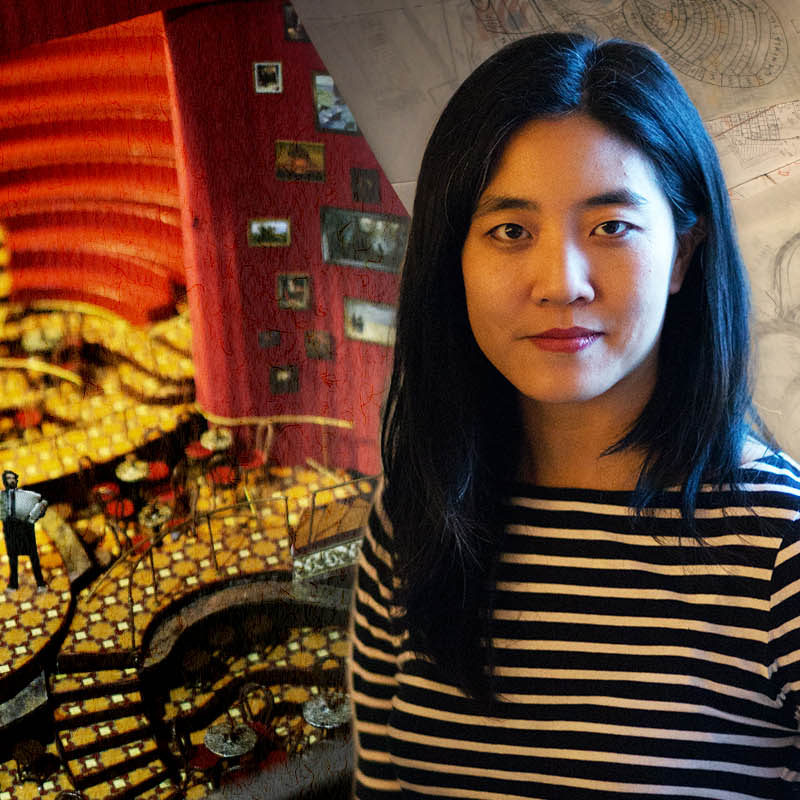
Mimi Lien on the Set Design of “The Great Comet of 1812”
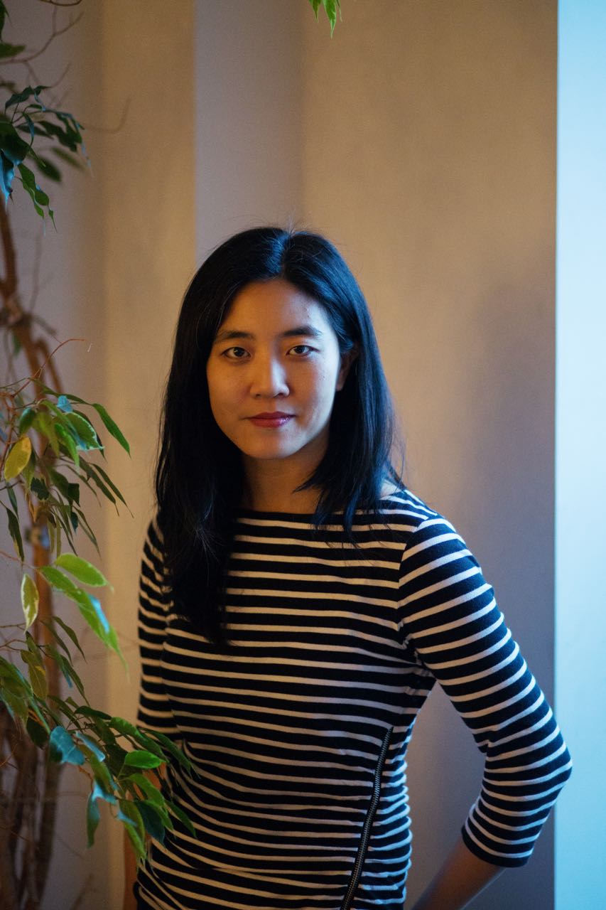
Photography by Tess Mayer
January 4th, 2017
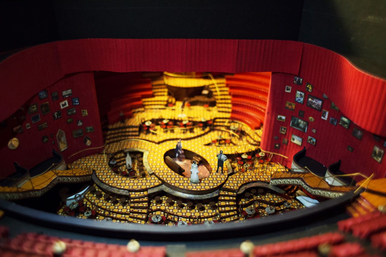
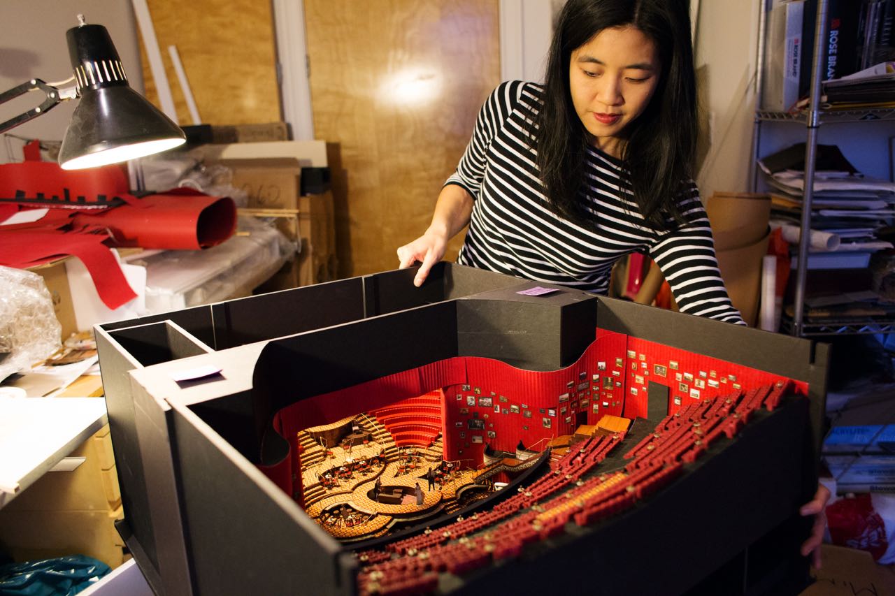
In a room off to the right of the living room in Mimi Lien’s Brooklyn apartment, there is a model of the Imperial Theatre on 45th Street, complete with miniature chairs, paintings on the walls, and a tiny piano. The model is just one of the steps that set designer Mimi Lien took to create the set for The Great Comet of 1812, the musical by Dave Malloy and directed by Rachel Chavkin that is loosely based on a passage of War and Peace. The set, which starts before even reaching the box office of the Imperial, creates a hermetic world not often seen on Broadway and one that completely transforms the physical space of the theatre. We visited Mimi at her studio and asked her to walk us through her process for creating the set.
On early inspirations and visual research:
I would say that for this piece I didn’t do a lot of image research. I did a little bit, and that’s what led to the paintings on the walls [of the set]. Because I was looking at period Russian rooms from the time, but they actually didn’t influence the bones of the design from the beginning. I would say it was actually weirdly very intuitive.
They had done one initial workshop, and I hadn’t been involved with the production at that time. Then they did a second workshop at Ars Nova. [The Ars Nova space is] long and narrow and it’s already set up a little bit like a cabaret. There’s a few different levels. Rachel [Chavkin] and Dave [Malloy] knew from the very beginning that they wanted to do something environmental, and so for the workshop they used the existing Ars Nova cabaret seating and sat the audience at tables and chairs around the room, and then cleared a path kind of down the middle. Actors were moving through the entire space and amongst the audience, but primarily in a more straight playing space.
I was sitting in kind of a far corner. I think some of the seating was raised a little bit, but the actors were primarily on the lowest level. I realized that I had some trouble seeing some of the actors. When I was watching them on that lowest level and I had trouble seeing them, I thought, “It would be nice if they were raised up a little bit. It would actually feel like they were floating through the space,” whereas, at the time, they felt really grounded and kind of low. I was like, “If we lift them up a little bit, that would feel good.”
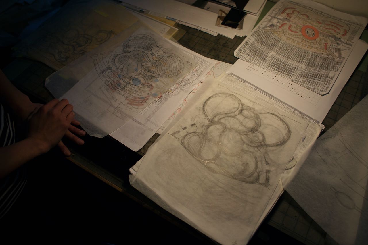
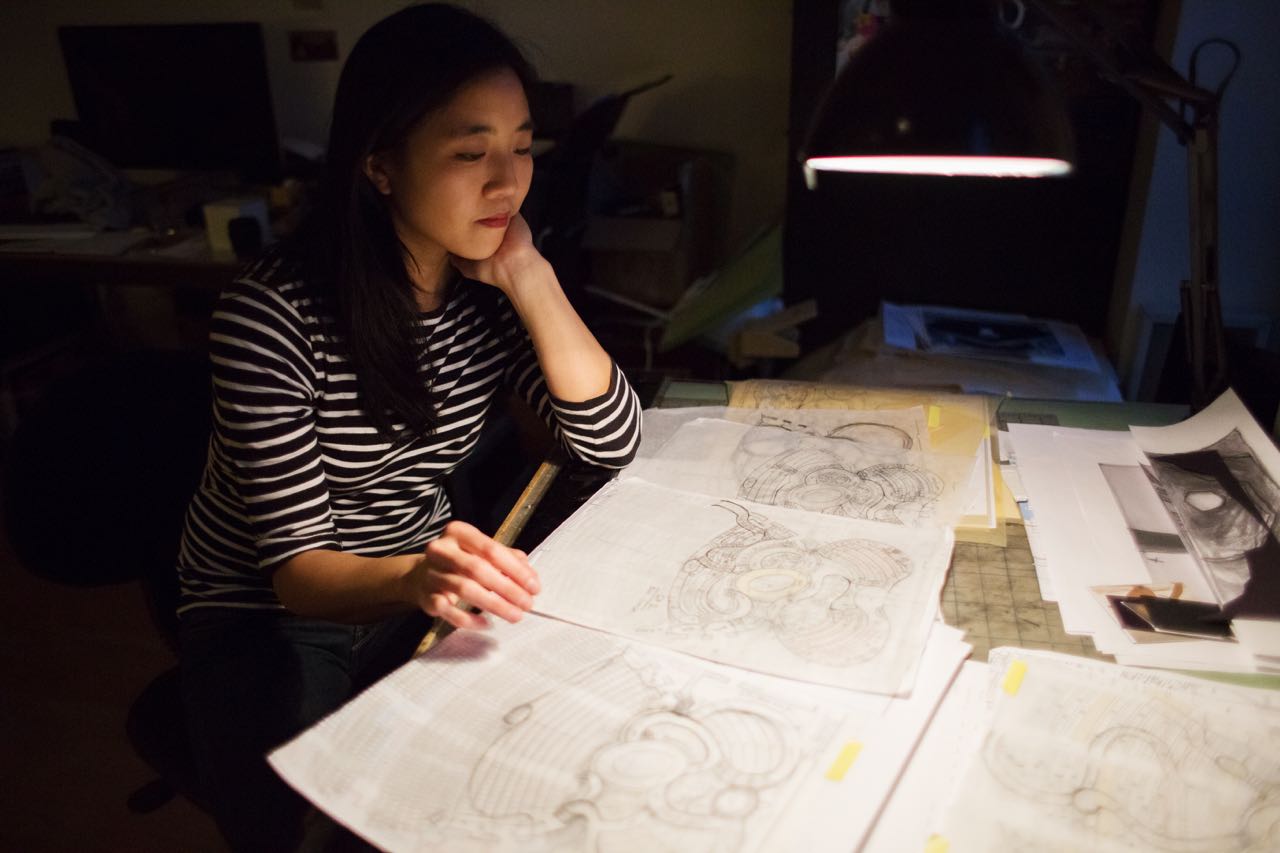
Then, as I was drawing the ground plan, I just started drawing these curves. Really, I have no idea why. It was pure intuition. When I think back on it, I think there was something about the rhythm of the piece and the way that the piece wants to move. There’s one particular moment when Natasha is reading a letter to herself silently during Sonia’s song. For that particular moment, I was like, “She needs to just be walking.” You don’t want to feel that she’s walking a straight line from one place to another place. She’s kind of in a space of her mind, and she’s feeling lost. She doesn’t know what to do, but it’s all quite beautiful. I think I wanted to draw a meandering path for her to walk on for that moment, and then that kind of dictated the rest of it.
The other thing, which did come from a piece of visual research, was that I looked up supper clubs because Rachel and Dave and I had been talking about this idea of it being a supper club. I just looked up ‘supper club,’ and it was not Russian. It was not period. It was just a booth somewhere in a restaurant. People were sitting in this half-round banquette. Often in those banquettes, there’s a surface behind that supports the shape of the booth. Sometimes people put plants there, or when you go to a restaurant, that’s where you put your hat or something. I saw that in the picture, and I thought, “Oh, that would be an amazing playing space. Wouldn’t it be cool if an actor was actually behind you when you’re sitting at this table as an audience member, and you feel someone walking behind you?” What I always want when I go to the theatre is for things to be happening where I don’t expect them to be happening. That was another key ingredient. I think that led to the design. We ended up having these curving pathways, many of which were behind audience members at Ars Nova, and then they had staircases that led down to the center. It was very much about circulation, and for Rachel, she’s the queen of circulation.
Those were the things that we started with and I feel like remain remarkably intact. People have been asking me how much things have changed. I think all of the designers feel like it has actually changed very little. The main ideas have changed very little.
On her early sketches:
This set, I feel like it’s quite different from a lot of my other work. A lighting designer commented on Instagram and said, “That’s a very voluptuous ground floor you made.” I was like, “Yeah, I guess it is.” It’s not typical. I don’t ordinarily have so many curves. It’s so organic. I was like, “I’m going to draw a pleasing shape on something that feels like it has rhythm and like I could see this kind of swirling composition of pathways.” People don’t normally see it from above. So I sketched these out, and then typically I scan it, and I have an assistant who then digitizes it and makes all the pathways as wide as they need to be for code reasons. Then, we draw in the number of seats and we basically start to make it real.
On changing the look of the Imperial and practical issues:
I would say the biggest practical issues were bringing everything out into the audience, into the house. At Ars Nova when we started out, we lined the entire room with red curtains and paintings because we wanted everyone to feel like they were in one room. The audience is in one room together, the performers are in one room together, the musicians are scattered all around that same room, and there’s a distinction that we wanted to draw between the inside and the outside. One of the first lines in the piece is, “There’s a war going on outside,” right? You’ve passed through this bunker lobby space. It’s cold, and it’s fluorescently lit and feels like a Soviet bunker.
Then you come inside, and I really wanted that moment of stepping inside to be impactful. This feeling of a warm, lush, opulent cocoon-like space was really important to us, and so we have hung onto that every step of the way. That also includes the chandeliers and the light bulbs, which were also a primary ingredient in the original design. The entire lighting design, the entire light plot was just light bulbs and chandeliers. There were actually no traditional theatre [lighting] instruments. In order to do that in a Broadway house, there was nothing to hang from above where the audience is, and so we had to create hanging points for all of the light bulbs and all of the chandeliers.
There was nothing to hang curtains from. It’s just plaster walls. There’s no pipes or anything. We had to build. There’s a whole system of pipes behind all of the curtains, which were really labor-intensive to put in. You don’t see it at all. You’re just like, “Oh, curtains.” For two weeks, I would come into the theatre, and there’d be like 80 people all around the theatre building scaffolding and putting up pipes in order to hang the curtains. That was a big deal.
I think the other big practical challenge that led to that was there were also no proper drawings of anything beyond the stage. They only have technical drawings, blueprints of the stage area, which is where they think you’re going to put the set. When we needed to put stuff beyond the proscenium, there were no accurate drawings that existed. Everything had to be site surveyed. They went in there with a spinning laser and did a 3D scan, essentially, of the whole theatre.
On the Soviet-inspired lobby:
That’s primarily stemming from the electro- of the electro-pop opera. It’s what we call the piece. The entire piece is pretty anachronistic musically and costume-wise. We’ve gone in that direction too. I think Paloma [Young, costume designer] and I have both drawn inspiration from the electronic music aspect of it. For me, I imagine the lobby to be like a Soviet bunker that’s been abandoned and has now been turned into an underground nightclub in Moscow in the ‘90s or something. Yeah, I feel like there’s so many archetypal layers of Russia, similar themes.
I grew up in the ‘80s, and so Russia meant Cold War. Maybe my first experience of Russia was Gorbachev. That side of Russia is probably what I experienced first, and then you learn about Imperial Russia. Anna Karenina was my first Tolstoy that I read, which was amazingly lush. I really wanted to read the book. I was like, “Here I am. I’m going to read the book.” I expected it would take a little bit for me to get swept up into it. I thought it might be a little dry at first, but I would persevere, but three pages into it and it was like a soap opera. I was totally sucked in. Lush is the word that I tend to use. I feel that’s what I was trying to create with the interior space.
And then I layered on the Soviet space, as in the ‘90s, [when] the Soviet Union dissolved and Russia became its own thing, and there’s another vision of Moscow in the ‘90s and the Millennium, which has to do with the oligarchs and a lot of money and wealth.
I do feel like [the lobby design] might be something that people miss. I have talked to people who go to the theatre a lot who went to the show and didn’t realize that the bunker was part of the design. The one time that I did enter the theatre as an audience member, they herd you through so quickly that you might not be looking around, and it’s so full of people that you can’t really see. For me, it was an important part of the process and the journey of the audience was the driving principle of the design, and that is a big part of that journey.
I don’t need them to sit in the space, but I guess I wish that you had a little bit more time and you didn’t feel like you were herded so much and you have a sense of mystery, I suppose. I think the logistics of having to get 1,200 people into the theatre means that they herd you along pretty quickly, but if there were fewer people and you were let loose and you just had to wander, that would be my ideal experience. Then you turn the corner, and you find yourself in the double doors and in this lush red space, and you didn’t expect that. That would be cool.
On anachronisms and the many things that influenced Russian culture:
I feel like Paloma really ran with that in the costuming. I know that Paloma had free rein to kind of pick and choose. For her, I know that the principles are closest to period. I think she described them to me once as concentric rings going out beyond the core principals. Balaga [the character] is a little bit of a mash up of a lot of different things, and then as you move out into the ensemble, they definitely are.
It’s amazing to me, actually, what she does, because you look at it and it just looks right. Then when they come up close to you, you can see all the pieces of it. You’re like, “Oh. Nothing is authentic. Nothing is period, and the materials are all found objects, but she puts them together in a really amazing way.”
The song “The Duel” with the strobe lights is definitely, in terms of the staging and the music, the most referential to the electronic music element of it. We talked a lot about how even in Tolstoy’s times there were so many strata of society. There’s the troika drivers, who were lowly peasants, and then all the way up to the aristocrats. I think Tolstoy did write about people in different levels of society. I think the club maybe does that in a temporal way in addition to a social way.
On the paintings that line the walls of the set:
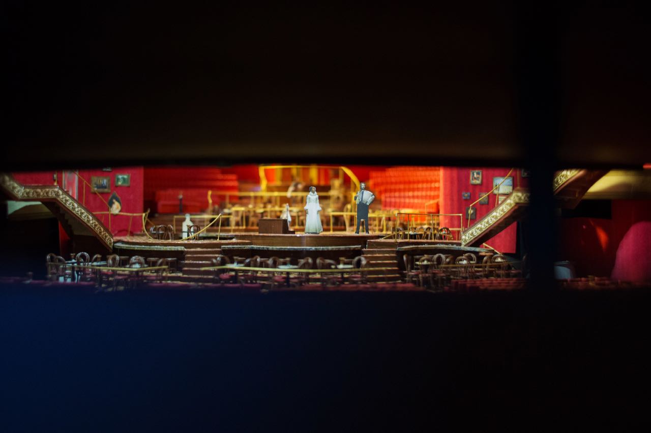
There’s a system. There are areas. Like, there’s one corner where there’s all the religious icons and stuff, and it relates a little bit to Natasha when she goes to church. Then essentially, one side is mostly battle paintings, and one side is mostly landscape paintings, so it’s kind of our War and Peace. Then, as it comes around near the proscenium, it’s things that refer to the theatre and the opera. There are a lot of interiors of opera houses and scenes from theatre. Then around the corner, we happen to have a lot of portraits of people reading, so there’s this reading nook. Then there’s multiple portraits of Tolstoy. So there is a logic to it, but it was crazy because we found the images, essentially, all online, all public domain, and we printed them on canvas, and then mounted them on wood, and then flame treated them all. Then we found all of the frames [at thrift stores]. We had to decide the composition of frames on the wall, and then we had to assign image to frame, and certain images look better in certain frames, right? So, we had to assign the images. Then, measure the inside of that particular frame, and then Photoshop resize that image in order to print it. It’s a weirdly elaborate system.
On working with the lighting designer:
The set and the lighting design in this just go hand in hand. It’s super close.
At Ars Nova, Bradley [King] used the light bulbs to light the show, basically because the ceiling and the grid was 10 feet total. Then we raised up the actors three feet, so they were at nine feet. There was no room to use actual theatrical lights. I really wanted to create a canopy over the audience because I thought, well, when you go into a theatre, typically there are these lights overhead, but you’re not supposed to notice them. They’re what create the illusion, but they’re not part of the environment that you’re supposed to take in or the set design. You’re just supposed to ignore the lights.
I feel really strongly that when you walk into a space, the ceiling actually tells you a lot. When you walk into Grand Central Station, that’s an amazing space because of the ceiling, because of the volume of the space, both because of the height and also what’s on the ceiling. Similarly, when you walk through a subway tunnel and the ceiling is seven feet, you really feel that compression. I felt like creating a ceiling made up of chandeliers and light bulbs would, A) make everyone really aware of the room that they’re in and, B) create a very warm incandescent light kind of feeling. That’s what we did at Ars Nova, and then it became the lighting palette.
Then when we moved to the tent we kept the light bulbs, because Bradley uses them to light and he uses the light bulbs to tell you where to look a little bit. When someone’s singing a solo, the light bulb above their head turns on. That’s something that he came up with at Ars Nova, and that we’ve tried to keep the whole time. When we moved to the tent, we kept all the light bulbs and the chandeliers, but he also had to supplement with some theatrical lights because we were in a bigger space. Then when we moved to A.R.T., again, we kept the light bulbs and chandeliers, but added more of both, and also more theatrical lights supporting that.
Now, we’re basically just trying to do the same thing that we did at Ars Nova but in a Broadway space. That’s where we spent our money. We didn’t really spend it on anything fancy or any tricks that you might see on Broadway. Just to get the light bulbs, just to keep doing what we did at Ars Nova, that was the main goal. All of the other spaces that we’ve been in have not had two levels of audience. It’s basically been one room. Even at A.R.T. when it was kind of a proscenium, there was no balcony. The light bulbs could be stationary and do what they did before, but here, because there’s so much more height and there’s people who have very different sight lines, basically, we had to have the light bulbs move up and down in order to deliver them to be a light bulb above an actor’s head but also get out of the way so that it wasn’t in sight lines blocking the door for everyone’s opera entrance.
It was actually a practical reason that the light bulbs were put on winches. We were all like, “Oh, yeah. It’ll be great. We’ll have them move up and down during the opera, and who knows? We’ll see how else we can use them.” Then during Natasha’s song, we wanted to create this kind of starry sky. They definitely came in very handy.
On working with the sound designer:
Even starting from the tent, the sound design in this show has always been extremely challenging because they’re moving around the space. In a smaller space, you didn’t have to track them as much. This was a crazy thing to ask of a sound designer and Nicholas Pope did an amazing job.
I feel like he really just set out to meet this challenge, and so there wasn’t a whole lot of him calling me up and asking to adjust things. It was actually more the other way around. I would say, “I will try to accommodate your needs as much as I can because I know this is a crazy thing that you’re doing.” He said, “Well, I’m going to need surround speakers all around the audience.” Because we’re treating the entire space as a playing space, there’s nowhere that’s out of bounds, right? Anywhere that he wants to put a speaker, I have to figure out how to make it look okay. I ended up hiding a bunch of his speakers behind paintings. There are certain paintings that are printed on scrim that are not on wood. The speaker is behind, and the speaker, you can hear there’s sound that’s coming through the painting.
On designing the comet:
It was a collaboration. I drew it, but before I drew it, I asked the lighting designer, “How many light bulbs do you think you can handle?” or, “In terms of circuiting, how many do you want?” He told me a rough number, and then I drew it. It ended up being slightly different, so it was a real back and forth.
In my mind, there wasn’t ever too much of a question [about style]. All of the other chandeliers that are all over the room are similar. I think this is the interesting thing about designing a show over the course of four years and then changing it slightly is that I probably would have made a similar decision. Essentially, we designed it at Ars Nova. We had this idea of kind of a mash up between a 1960s Russian sputnik light fixture and the Metropolitan Opera chandeliers. Because it is an opera, that’s very much a part of how we’re treating the whole thing. It’s part of the wink-wink. The actors come up to you, and they’re like, “Yeah, you’re at the opera.”
I love the Metropolitan Opera chandeliers. That’s my favorite part about going to the opera or going to the Met. When we were at Ars Nova, we basically came up with this design that was kind of like a sputnik and kind of like the Met Opera. It also kind of looks a little bit like a mine, like a bomb. Basically, I’ve just been improving on that as we’ve gone along. The very first time we made it, I bought off-the-shelf lamp parts from Canal Street and brass tubes and lamps and just made it myself, and Bradley wired it. We just made it ourselves, and we had two chandeliers. Then when we moved to the tent, we had someone weld seven chandeliers together, and so it was slightly better, but it’s still spray-painted gold. Then when we got to A.R.T., we basically had a similar ground plan as this one, and we built a larger version.
Basically, they kept getting bigger but the design remained the same and the shape remained the same. For me, it didn’t actually get to the point where I was like, “Oh, my god. There’s so many options of what it could be.” It was kind of like, “We know what it’s going to be, but it’s just going to be bigger and better.” I guess the big thing about the shift to Broadway in terms of the chandeliers was that we got a sponsorship through Swarovski crystals, so we were able to really bling up the chandeliers. There’s something like 26,000 actual crystal beads. Swarovski donated all those crystals. They donated the fabrication of them. I drew up these starbursts and they laser-cut these metal armatures and put the crystals on them and then shipped them to us ready-made, and so we just put them on the chandeliers. So I would say we always kind of knew. For four years, we’ve been referring to these chandeliers as comets and that one as the great comet, and so it was sort of a known entity.
On if the design reflects the structure of the original novel and Tolstoy’s writing:
Maybe the choice to make it a non-representational space. I feel like was a choice. In a way, the set, it’s almost like a blank canvas. There’s not anything that tells you where you are. The space exists for the audience to enter the event, but there’s no formal things about the set that are derived from a location or a particular form that Tolstoy takes. I feel like the idea for me was to create this space for the event and for everyone to gather, and then the staging could be freed from any of these different ways that Tolstoy is using his language.
Interview conducted and edited by Victoria Myers.

