The Woman Behind the Images: Paula Scher on Creating Brand Identities for New York’s Cultural Institutions
Interview by Victoria Myers and Desiree Nasim
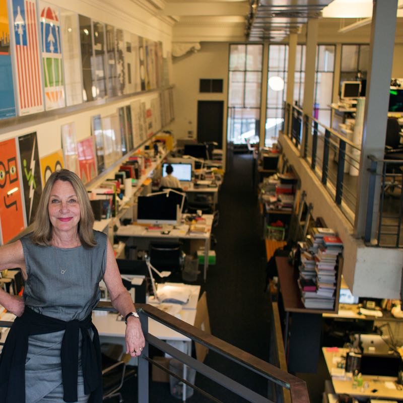
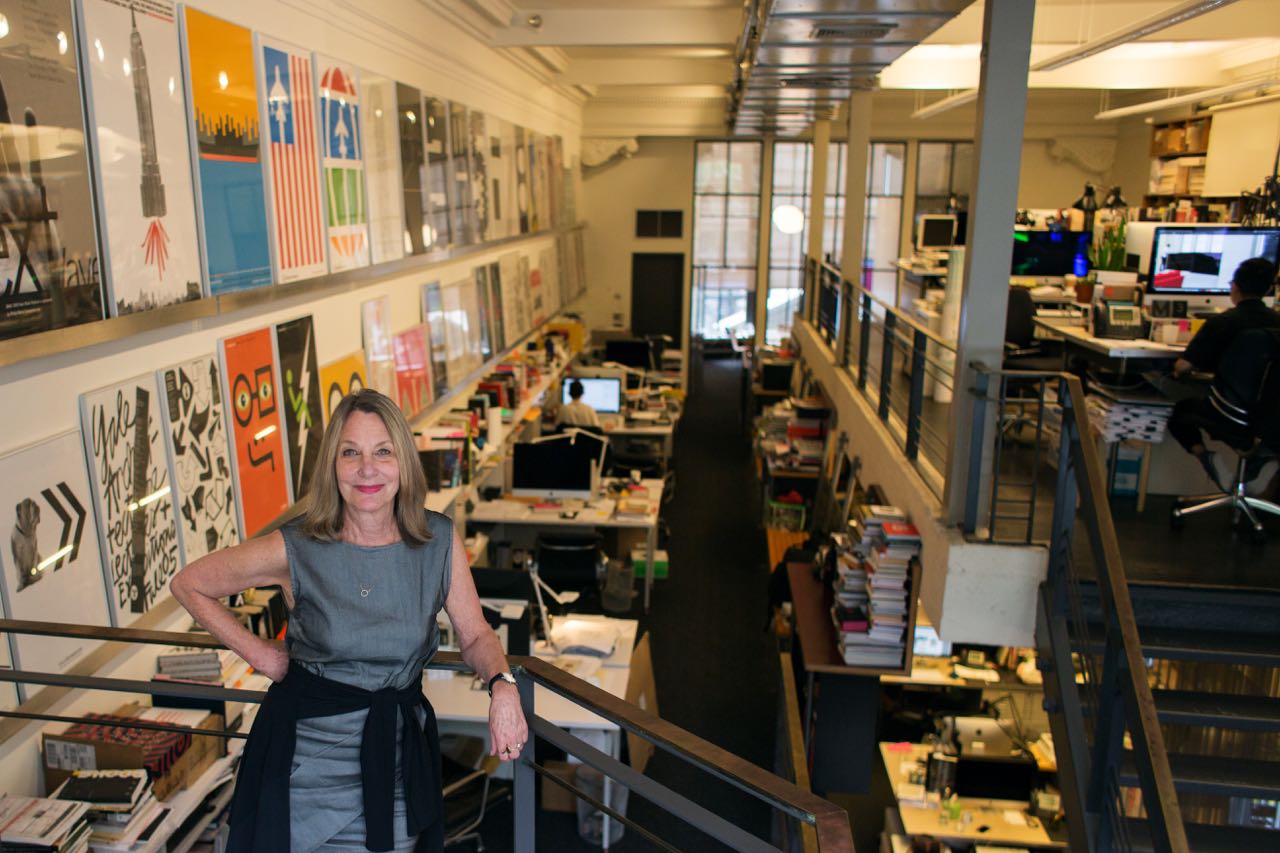
Photography by Tess Mayer
October 10th, 2017
Visual storytelling in theatre starts before the curtain goes up, only it’s an area that audiences don’t always think about—or at least don’t always know they’re thinking about. How much do a theatre’s logo and show posters affect how people view that theatre and how inviting they feel the space is? It wasn’t something I’d thought a lot about until Desiree Nasim, The Interval’s graphic designer, started extoling the virtues of Paula Scher. Paula Scher is one of the leading graphic designers in the country. Her work can be seen all over New York City, and has helped shaped the idea of what New York looks like. She’s also responsible for the branding of a number of major theatre and performing arts organizations, including the iconic Public Theater posters and logos. We recently sat down with her at her office at Pentagram to discuss how she branded The Public Theater and other institutions, how she thinks theatre marketing can be improved, and her design process.
When you first started working on the Shakespeare in the Park posters, how did you conceive what you wanted the posters to look like?
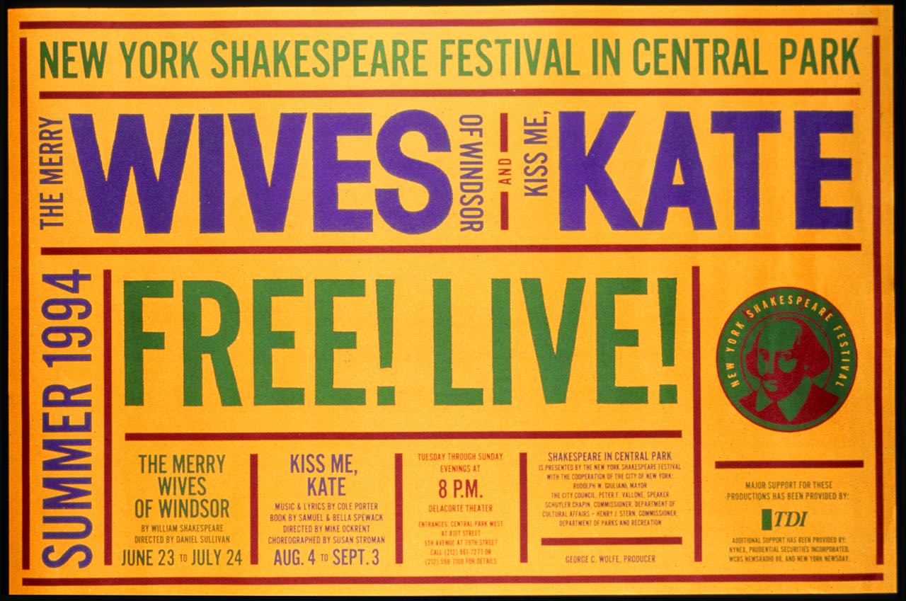
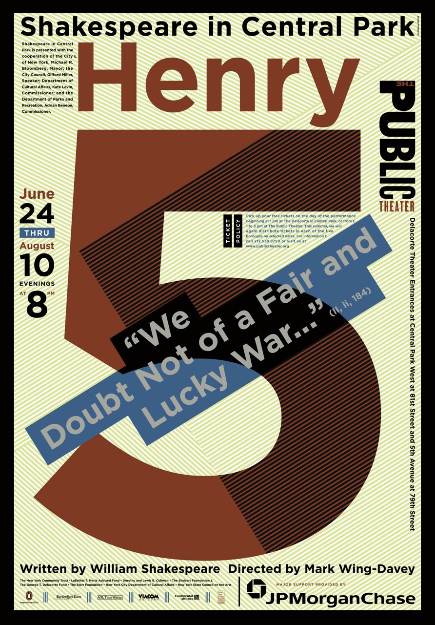
Well, everything was a little bit accidental. George Wolfe did not commit to hire me to do an identity right away. He gave me Shakespeare in the Park first, which was in the summer of ’93 or the summer of ’94. There were two plays that were going to be shown. It was Kiss Me, Kate and then there was Merry Wives of Windsor. The problem with the two plays in the summer is it’s difficult to do one image with the two plays.
When they brought me on, the issue was that the posters had been done by Paul Davis every year, and they were usually a painting of the star of the play. They wanted to neutralize that, because what had happened was over time it had gotten very hackneyed because the stars of the play always assumed he was going to get his picture painted by Paul Davis and they got very involved and started looking at their noses and so on, and then all that made the work a little more boring.
The other problem was that at the same time, Paul was working for Masterpiece Theater on public television and there were Paul Davis posters around for that. New Yorkers were confused about it and they had some data to show for it. So, when I started this, it was specifically to not do images like Paul Davis. Do something else. The other point was they wanted to emphasize that it was free Shakespeare. They thought that was very important. The free part still is.
So, I wrote a line for it that said, “Wives and Kate in Central Park. Free. Live. No waiting,” and so it sounded like we were selling whores, but it was actually just this very funny way of doing it. I did it in great big wood type, and I did it in a font that was similar to the fonts we ended up using for The Public Theater, and these were configured as horizontal and vertical images and you could tell it was one campaign. They went up all over the city. Then they couldn’t get the rights to use this new rewritten Kiss Me, Kate musical because the family protested, so the play was changed after all the stuff was up. They changed the play to Two Gentlemen of Verona, so we wrote, “Wives and Gents in Central Park,” and went around and covered all these posters with the word ‘gents,’ and that’s when I knew that The Public Theater was going be all typographic because if they’re going to change the play every five minutes, what if we had actually drawn somebody’s face? It wouldn’t necessarily have been able to be changed like that, so that really happened.
I was reading in another interview you did they described your Shakespeare in the Park posters as the first American Shakespeare posters, and I was wondering what that means visually to you?
It was really ironic, because I don’t think about it that way. When I first started doing the Shakespeare posters in summer, and then ultimately the Public’s whole season, I really was inspired by the way the West End has these painted buildings that still exist with all the plays and what’s going on in the theatre, and it would be the name of the play and the date and then time. It seemed to make so much sense. When they started doing theatre advertising, there used to be things like, “The Wiz is a wow!” and there’d be some goofy logo and a little tagline like that. I thought that was really vile, and I thought that they had it right in 1870. Let’s just go back to that. It would be the name of the play, the type of theatre, etc. Then it became something that looked American because people were still doing the other form of theatre advertisement, so doing a Shakespeare play that way seemed like, “Just the facts, ma’am,” and people thought it was a very American way to do it, but the reality was I stole it from London.
There was also something about the boldness of the posters that people thought was very American?
It was also the color system. They were very loud and they yelled and they were in New York City: “Two Gentlemen of Verona! 8:00!” That was the method of it, and it’s still like that. They’re designed to live in New York City. You can’t put a little thing with little curlicues up in New York City—it’s going to disappear. The other thing was that if you think about European posters, particularly Polish ones, when it comes to things like Hamlet, it’s always like some illustration of a guy holding the skull. Enough.
When you started working on rebranding The Public, what was your process for conceiving it, and how did you balance what the institution wanted to be with where it was in its history at that moment?
It was a radical departure. George Wolfe did not directly follow Joe Papp. There was JoAnne Akalaitis in between and she had continued some of what Papp’s approach was to advertising. George wanted to make a complete departure to develop his own view of what the theatre should be, otherwise he would always look like a weaker version of Papp. So, the notion was to make it visible in New York City, to be inclusive of everyone, to be loud and proud and take the city by storm, and that’s what we did.
It was typographic. The style of the posters in the first couple of seasons were pretty powerful. They were designed from the plays as much as the identities, so there was a real crossover. I don’t do that anymore. Now, we do a season and the plays all have a look for the season, even if it’s Hamilton. In the beginning we used to really design for each individual play very specifically and in those days they actually printed the posters and they bought newspaper advertisement where you could see the image, so it was more like a Broadway theatre.
That wasn’t really effective for The Public, and now I advise the theatre groups against it because what happens is if one play’s a hit, you remember the play, but you don’t remember the theatre. If the play isn’t a hit, you don’t remember the play or the theatre. You just know that one image you saw and you don’t know where it’s from, and that’s really bad for these group theatres. People don’t have enough money collectively to really support one individual play. If it gets a lot of press, it’ll be supported by itself. It’s a tricky thing. But when you do a season, it’s actually very visible because you’re seeing it continually, so you recognize the place.
You mentioned that part of the idea for the posters was to try to make something that was inviting and inclusive. Can you talk a little bit about how you put that into the visuals?
I can’t. I don’t know how to describe how you do that. There was a populous feeling about them. They looked heroic. They were sort of funny or powerful or dynamic. They weren’t overly intellectualized and they didn’t have complicated information. It had the name of the play and where it was playing. You can tell from the beginning, like with The Diva is Dismissed [a one-woman play at The Public in 1994], the woman has all this stuff coming out of her mouth. That’s what she did. She got on stage and screamed at the audience for about an hour, so the poster looked like what it was. It didn’t mask it and it was sort of identifiable—it looked like The Public. They looked connected.
How else did the posters evolve?
There were some highs and lows. In the beginning, when we first invented the look of it, it was really amazing because you saw it right away. It was back in the days when there were phone kiosks as well as subway posters, and you really saw it right away. It looked like something that happened. It was successful almost immediately. It was really shocking.
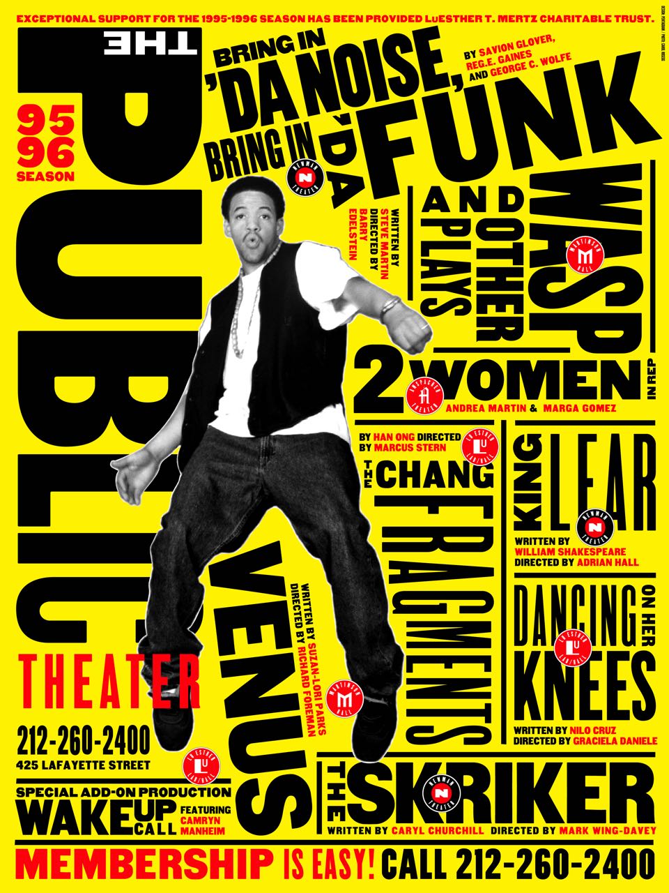
When we did Bring in ‘da Noise, Bring in ‘da Funk, which really coded in New York City, it became this style. In other words, people looked at it and other designers began copying it. For a period of time New York Magazine was designed like that or various other small things were designed like that, but then Chicago was designed like that and that was bad for The Public because Chicago had a lot more money, so to a degree, that style ate The Public Theater’s identity. Because if everybody uses it, The Public Theater has no identity. At which point I thought, “Well, what I’ll do is I’ll change it every season.” So I started changing the typography, leaving the Public logo, and I did that for a period of time. Some of the posters are good and some of the posters aren’t good, but the end result was bad for The Public because if the poster was a hit like Topdog/Underdog, you remembered the play but you didn’t necessarily remember the play was at The Public, and when it went to Broadway you got doubly confused, so they didn’t get the credit for their good works because they began looking too dissimilar.
Then an amazing thing happened. There was a period where George left and Oskar Eustis came on and there was a co-management director who had approval power of the posters and they were disagreeing. I think that that period was probably the weakest period of the poster design because there wasn’t one viewpoint. There were two viewpoints. Then the middle director left and Oskar became the sole director and he did something miraculous: he asked me to revisit the theater all over again.
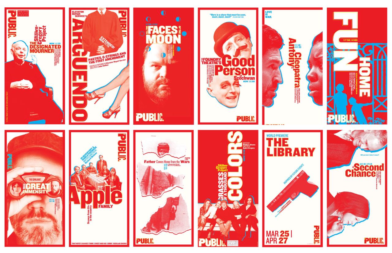
At that point in time, they weren’t printing the posters anymore. The posters were digital, and I began to realize that it’s the collectivization of this stuff, and I began to design something simpler that could be moved around, that other people could use more easily, it didn’t have to just be me, that there could be a staff down there because Oskar seemed much more ambitious to accomplish a much more. We designed this very black-and-white identity that we used between 2008 and 2012. During that period, we redesigned the lobby, and when the lobby was finished and we took all the posters and put them behind glass behind the box office, it looked to me like that was where posters belonged, and that I had to think of things as a much broader pallet in terms of electronic media versus big image.
A woman from my class [at School of Visual Arts] named Kristen Hoover went down to work at The Public Theater and she was assisting me on the work, and then as we were working on Joe’s Pub, I didn’t like the way Joe’s Pub looked in relationship to The Public. So I started to figure out this notion of this annual system where the summer poster would become the look of the season, and then everything would be designed against that premise for a year, and then at the end of the year we’d stop and we’d go into next season, which is what we’ve been doing since and it really works. I think it’s the right thing for them.
If you’re dealing with a theatre company that’s trying to somehow change its image or reach new people, what’s the guidance that you’d give them in terms of how to do that visually?
I try to find out what they’re about. When I did the Atlantic Theater, they were giving their plays out to some Broadway design house that made individual plays like they were Broadway plays where none of them were related. There was no look to the theatre, there was a logo that nobody understood because you didn’t see it in repetition, and there these sort of individualistic plays that looked like they could come from anywhere, and it was almost as if they were throwing their money away. If they had a hit with Spring Awakening, that’s swell, but nobody knows that it came from the Atlantic—same problem [as with the Public]. The goal with them was to make them look completely connected all the time and we went very tight with them because they only do about five productions over the course of the year. We found this A where the A in Atlantic, if you fold it in, could be either a megaphone or a spotlight, but it was a wonderful way to hold photographic information, so we began using it as a background for imagery, and very often when they would announce the plays they didn’t have any pictures of anybody from it, which is a usual problem, so we could use found images that represented the play and then change them to the actors and actresses later. It really worked well for them, and they’re in their third season now. It’s going pretty strong.
You also did the logos and posters for the rebranding of the New York City Ballet and The Met, two institutions that are very different from The Public and going for different images.
They’re all designed to reflect the institution. The Public is the down and dirty. It’s populace. It’s loud, it’s downtown, it’s theatre for all people. Atlantic is a little more controlled and it’s tiny. It’s got very excellent playwrights, it’s got beautiful work, maybe less experimental than The Public, but quality level the same.
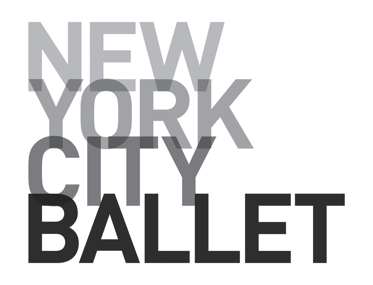
The New York City Ballet is all about Balanchine. The goal there was interesting because ballet companies usually look very florid and they look like Swan Lake with lots of curlicues and pretty dancers, and when you see the New York City Ballet, the ballet isn’t like that. It’s about this very organized structure, Balanchine, and the costumes aren’t like Swan Lake costumes. Peter Martins, at that particular time, wanted a logo that was fairly flexible because he wanted to be able to change it each season but still be recognizable. So we did a stack logo that can exist on three lines, two lines, one line, and that it was this gradation of dark to light, largely because he had a name change—in other words that he was moving the City Ballet to the New York City Ballet, which was a very important part of the shift and that the black-and-whiteness of it made it New York. The stacking of it made it rather strident. It was very modernist. I think it was really right for the theatre and they use it pretty faithfully.
The Metropolitan Opera was really about their name. They had lost their name because the Metropolitan Museum of Art had stolen it by having a better shopping bag in 1970. They were both The Met, but The Met used to mean the opera, not the museum. I knew they couldn’t get back The Met, but they could get back Met Opera. So what we did is the break of the typography. It says The Met/ropolitan/Opera. That break actually is what gets them back the name. Sometimes it’s on one line and The Met is black and “ropolitan” is in gray and Opera’s in black.
If you were going to give cultural institutions and theatre companies advice in moving forward with kind of the challenges that a lot of them are facing in terms of finding audiences, what is the thing that you would tell them to do to change their visuals?
When you go to almost any organization, whether they’re theatres or whether they’re anything else, usually you find out that things are inconsistent because there are people that are heads of different divisions and they make their own decisions. You’ll see, “Oh, this came out of the development department, and oh, this came out of the marketing department,” and they don’t look anything like each other. They can save a lot of money and probably only have to do things once if they get together as a group and determine they’re going to do things collectively.
Having a visually recognizable system is exceedingly important and they should hire somebody who knows how to give them that—and not everybody does, so they have to learn who is good at that sort of thing and hire that kind of person. There are a bunch of firms who do it well, but not everybody does it well. Usually advertising agencies are terrible at it, but design firms aren’t because they understand visual identity and language—it’s a matter of having type choices, color choices, methodologies of pairing imagery and putting things together so they look consistent and recognizable even as they change meaning and input, and that’s what they need to do. That’s how they get the biggest bang for their buck.
Is there anything that you see in theatre advertising where you’re looking at the posters and being like, “Well, yeah. That’s why you’re having a problem in terms of either not getting the audiences you want, not getting diverse audiences, not getting young audiences”?
Sure. All the time. I can see what the problem is walking in the door. I think Broadway’s very bad at it, to be honest. I think all their designs are very insipid. It’s like they’re afraid. They think the public’s stupid, and they don’t try to raise them up, they push them down. They try to make things the lowest common denominator or they’re worried somebody isn’t going read a lot of type so they make it too big and then the other thing has to become bigger and then there’s no scale or balance in the thing. Mostly, they suffer from being all over the place and too busy and too fussy and try to solve too many problems. I feel like they’re all so pained, “Oh, we don’t know what we’re doing so we’ve got to do everything.”
[Editor’s Note: From this point forward, all questions are asked by The Interval’s graphic designer, Desiree Nasim.]
Where do you find your inspiration and what is your process when beginning a project?
There are a couple different ways to start, but I have inspiration stockpiled. I have a lifetime of absorbing artwork, other graphic design, history, movies, walking down the street—everything is fodder. The fodder’s over here at one side of the brain, and on the other side are the people in the brief, and you’re really looking and listening to your clients based on where they’ve been and where they’re going, and then you begin to try to create a language and a basis for them to get where they’re going, and that has to do with who they think their audience is, what their problems have been in the past, and how much they want to make a statement about who they are to be recognized and then lead them to how to do that, and it’s a little bit of trial and error.
It’s sort of like being in a lab. We make a series of experiments that are called phase one, and that’s taking the input they gave us and making some demonstration that demonstrates type faces, color palettes, ideas, themes and motifs, and ways of seeing if a bunch of things are recognizable as one thing. It’s a little bit like a scientific experiment. How much do you recognize this thing over here? Three are in a row, one looks weird. Okay, what’s wrong with that? We have to figure that out and fix it. Or they all look alike, but if they look too much alike and they want to differentiate the plays, then you resolve those issues in phase two, so you can make corrections and accommodations.
Then, in the third phase, you’re teaching them how to work with it and figuring out how they’re going execute it. That’s the hardest phase of all, because sometimes I set up in-house art departments, so I’ll find other people to do some of this work for us. Mostly we do the first launch and then we try to staff it, and that person would probably work with us pretty closely in the first six months to a year until they can really take it over.
Many of your projects have been based on typography and you’ve become a real inspiration, but because it’s a technological age, the options for typography are endless right now, and my fellow young designers and I are excited about typography but also overwhelmed. What are some of the steps you would take in either choosing a typeface or creating a custom typeface? What is your process specifically on typography?
It comes out of the brief. You look for coincidences and you look for things that are alike with typography, things that you know will be recognizable. For example, the Pasadena Playhouse, which we did recently, if you take the word Pasadena, it’s got three As in it, so that’s lucky. If the As become distinctive, you have three opportunities to be recognized, because this thing is going to be run by the repetition of them. So we took a letterform that we drew that was based on the architecture, because Pasadena Playhouse is not just a theatre, it’s a theatre in a specific building, and the building is in Pasadena.
Pasadena has sort of southwestern architecture that’s like American arts and crafts, and it’s a wooden building and with these arches, and the stage is designed like that. So we took the base of the stage and made that the width and scale of the top of the A so it was like a curved letterform that existed in thin and thick. If you go back and look at the identity, you’ll see how it came right out of the architecture. And then it has the three As, so every time you see it, you recognize it as Pasadena, and intellectually it can actually be recognized fairly quickly because it’s extreme. If you use a type font that is more typical in style, like say Helvetica, you could make something that’s very old and very beautiful, but it may be harder for it to be recognized because it is not extreme. It looks like other things that are designed like that, so [in designing] you look for those kinds of things that make something look a little bit off.
You’re looking for those extremities where somebody will say, “Oh, I recognize this is that place.” It’s classic identity design. You’re doing the same thing with logos. If you design a logo for something, you want something that can be read and understood instantaneously. How is that form recognized and how do you make the association between that form and whatever the place is? That’s what the goal is.
Do you have any tips and tricks for productivity? What do you usually do when you have a creative block?
I think that sometimes when you’re tired, you’re not very creative, or if a client is just utterly depressing and sucks the air out of the room that can happen. You don’t feel terribly creative. Sometimes the job is dry. All those things really provoke creative blocks, and you sometimes have to ask yourself the question, “What’s causing me to feel this way,” because sometimes you think it’s yourself and then you look at the situation and you go, “No, this is horrible. They’re terrible. I shouldn’t be working for them.”
Sometimes that’s the answer too, but the thing is, if you’re in New York City, it’s not hard to fix it. Go to a movie, go to an art museum, take a walk, go shopping. All that stuff breaks it up because you get ideas when you’re not concentrating. If you’re concentrating and saying, “Oh, I’ve got to have an idea for this,” you’ll never have an idea. If you allow yourself to be in free fall where you’re not especially thinking about it, it’ll bubble up on its own. Some people wake up in the morning with ideas. Some people will get them while they’re going to sleep. Some people get them in the shower. I get them any time I’m bored because it releases my unconscious and I can start to free associate.
Something that has been a pressing trend today is the need to brand yourself, especially as a young designer with social media. Along with identity design, you’ve done a variety of projects with different design focuses, but what advice do you have for young designers who may be struggling to stay out of the confinements of one design area and struggling to not be typecast?
I think as a young designer, there’s no reason for you to be typecast. I think you should be free to work on any kind of thing you can work on. I mean, know how much territory you control. If you work for a company, you’re generally stuck doing whatever the company needs to have done, but you can always take on freelance. You can always work for free and then take control of your work that way. That’s what I did.
I really believe in pro bono work, not to be generous, but to actually get control of what you’re making. Because you can only usually get work based on what you’ve already designed, and if everything that you’ve designed is compromised by some client who had other needs against what you perceived to be the right thing to do, you never have anything to show. So, if you’re under 40, do everything you can to build the work up. After 40, do everything you can to make money. I always say to my students, “In your 20s you really don’t care what kind of mattress you sleep on. If you’re 40, it really matters.” So, make those decisions based on the fact that this is a long career.
What is the best advice you’ve ever been given?
Illustrate with type.
Another struggle that young designers may have is how to know when a project is finished and letting it go and moving on to the next. We’re surrounded by your work in this city, so how do you sort of move onto the next project and focus forward?
Well, you do run out of time. My problem is not knowing when I’m finished. It’s my clients knowing when they’re finished. They have to know they’re finished. It’s done. We did it. Don’t jerk around with it anymore. You’re only going to make it worse. People think that the amount of time associated with a project is what makes it good, and it really isn’t. It isn’t that kind of polish or perfection. What matters is how accurate you are in the assessment and the communication and how well the scale and the colors are working. If the scale and the colors are working and it communicates what you need to do, you’re done, and then you don’t want to mess with it because you’re just going to weaken it.
What are some challenges you face being a female designer?
You face them all the time being a female, so it isn’t really being a female designer, is it? It’s like, are you being heard in a group? If you’re in a group with men, are they giving you the appropriate respect when you’re speaking and telling them something? Where’s the eye contact in the power succession? When you begin to note that that’s actually happening, then you can take steps to correct it, but that’s what’s difficult, because it never stops. If I’m in a design meeting, my reputation precedes me mostly, but every now and then I’m in one where it didn’t, and then I just see the same pattern of behavior that I felt when I was 32. It doesn’t ever change.
What advice do you have for young, aspiring female designers?
Work. Do your work. Get good.